
I have left this page the same as I am happy with it. I will ask people for their ideas and thoughts before making decisions for the final design.
I have removed the grey background because I felt it drew the readers eye away from the photos and more towards the text. I have left everything else the same.
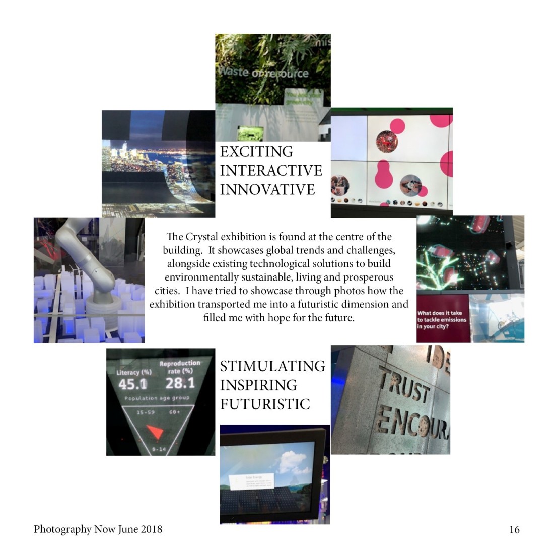
To improve the page, I need to align the photos correctly and placed the keywords in the same way as I did in draft 1 by having the shortest word in the middle with the longer words at the top and bottom of the field to give it balance.
I will ask people for their opinions and thought on my designs before making decisions about what to use for the final.
From my feedback I learnt that my lead page was fine but my second page had too many photos on so people could not see the whole photo and this ruined the images. The target audience is photographers and so it is important that the photos shown are of a good quality as well as reflecting my impressions of The Crystal. I will choose to use two photos – the Habitat exhibition and the Future Life Theatre for my next mock up.
